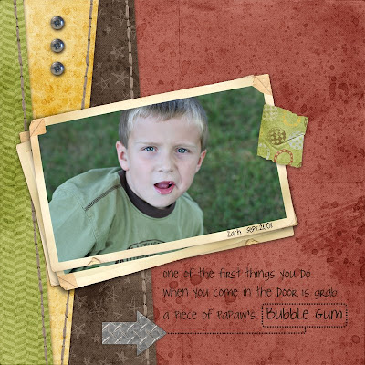
 Zach was out back one day this week passing football with his dad and I was trying to snap some shots and stay out of the way at the same time. This turned out pretty good even with the gum in his mouth.
I have been wanted to play around with some angles. I find them a little harder than squares & circles but I like how it turned out. I also followed K. Pertiet's tutorial for custom drop shadows. Not sure how I feel about them.
Digital Design Essentials Parker kit.

Wonderful layout. You keep right on learning cause you are going to be teaching me some day!
ReplyDeleteI like how you did the jounaling...especially the dotted lines around the word. How did you do this?
ReplyDeleteI used a path and a small circle bursh for the dotted lines. I did it on 2 layers,one around the word and one for the line. I did something that I have never done before and I saved layout #210 over #209 so I have to do this one again and I will write done my steps and what size brush and the spacing for you.
ReplyDelete